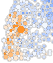
Global Digital Divide
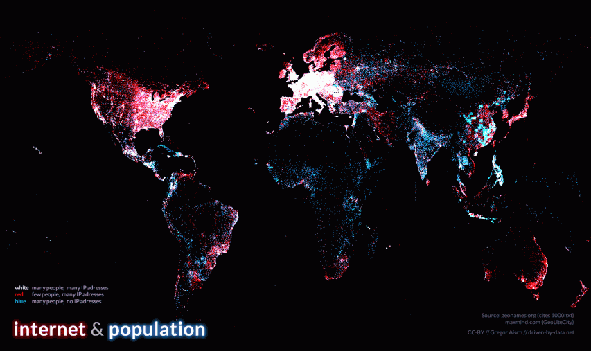
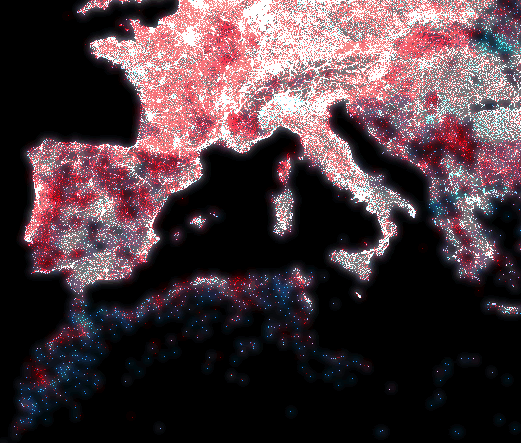
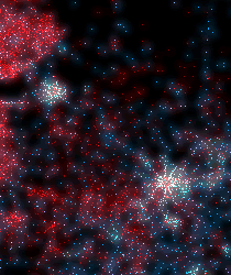
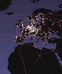
With this map I tried to visualize the global digital divide. It shows more than 80,000 populated places in blue and about 350,000 locations of IP addresses in red. White dots indicate places where many people live and many IP addresses are available.However, one problem of this method is that it doesn't consider the comparably high use of mobile devices to access the internet in African regions.
The IP address locations are taken from the GeoLiteCity database by MaxMind. The database of populated places is taken from geonames.org. The visual style is largely inspired by Eric Fischer’s wonderful Flickr-vs-Twitter maps.
The graphic was exhibited at

-
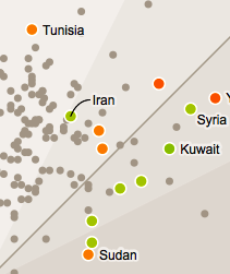
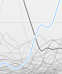
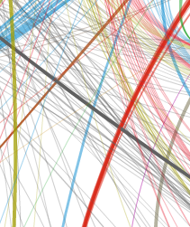
R Analysis of bias in opinion polls
Interactive visualization of the politcal CVs of German cabinet members.
-
The Cabinet(s) of Germany
Interactive visualization of the politcal CVs of German cabinet members.
-

Dataset: databases for lazy people
A handy Python library for managing databases – the pythonic way.
-
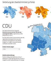
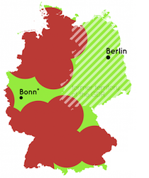
Lower Saxony State Election
A series of interactive visualizations and maps for German state election.
-
The Making of a Law
Visualization of the version history of the German law on political parties.
-
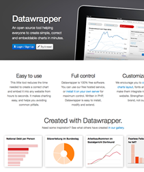
Datawrapper – Interactive Charting
An open source tool helping anyone to create simple, correct interactive charts in minutes.
-
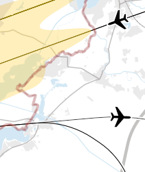
Maps for Berlin Brandenburg Airport
Using Kartograph, I rendered high res maps of airport noise, flight tracks and protection zones.
-
Education Around the World
Interactive Visualisation of Key Statistics in Education around the World
-
Kartograph Mapping Framework
A novel approach for mapping needs of designers and data journalists.
-
Chroma.js
Open Source Library for working with colors in visualizations
-
Stuttgart 21 Referendum
Exploring correlation between political preferences and referendum votes
-
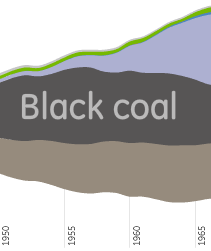
German Energy Landscape
A series of streamgraph visualizations around German energy data.
-
Mapping the Digital Divide
Showing the digital divide by mapping internet usage and population
-
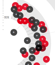
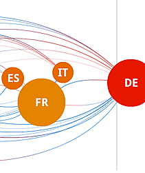
Faction vs Conscience
Closeness of coalition parties at roll-call votes in the German Bundestag
-

Streamgraphs in Flash
ActionScript3 fork of the streamgraph generator by Lee Byron and Martin Wattenberg.
-
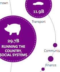
Bubble Tree Library
Open Source tool for visualizing hierarchical data using interactive radial bubble trees.
-
10 Years of Wikipedia
Visualisation of growth patterns of German Wikipedia
-
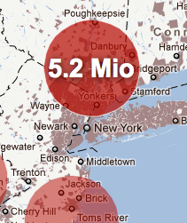
Population near Nuclear Reactors
How many people would have been evacuated in case of an accident?
-
Distances To Nuclear Reactors
Shortest distances to nuclear reactors, mapped for different countries.
-
Visualizing Plagiarism
Showing plagiarism patterns in Guttenberg dissertation
-
Europe’s Energy
Putting Europe's 2020 energy targets into context.
-
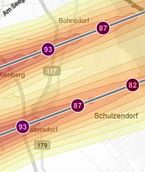
Mapping Airport Noise
Visualizing estimated noise of planned flight routes
-
Wikileaks Mirror Network
Animated map of the Rise of mirror servers after blocking of Wikileaks.org
-
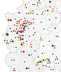
Incomes of Parliament Members
Map of the estimated income of members of the German parliament.
-
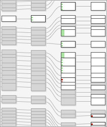
German Party Donations
Visualization of the network of parties, party donors and donations.