Distances To Nuclear Reactors
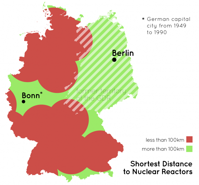
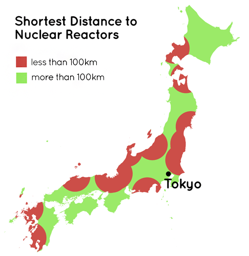
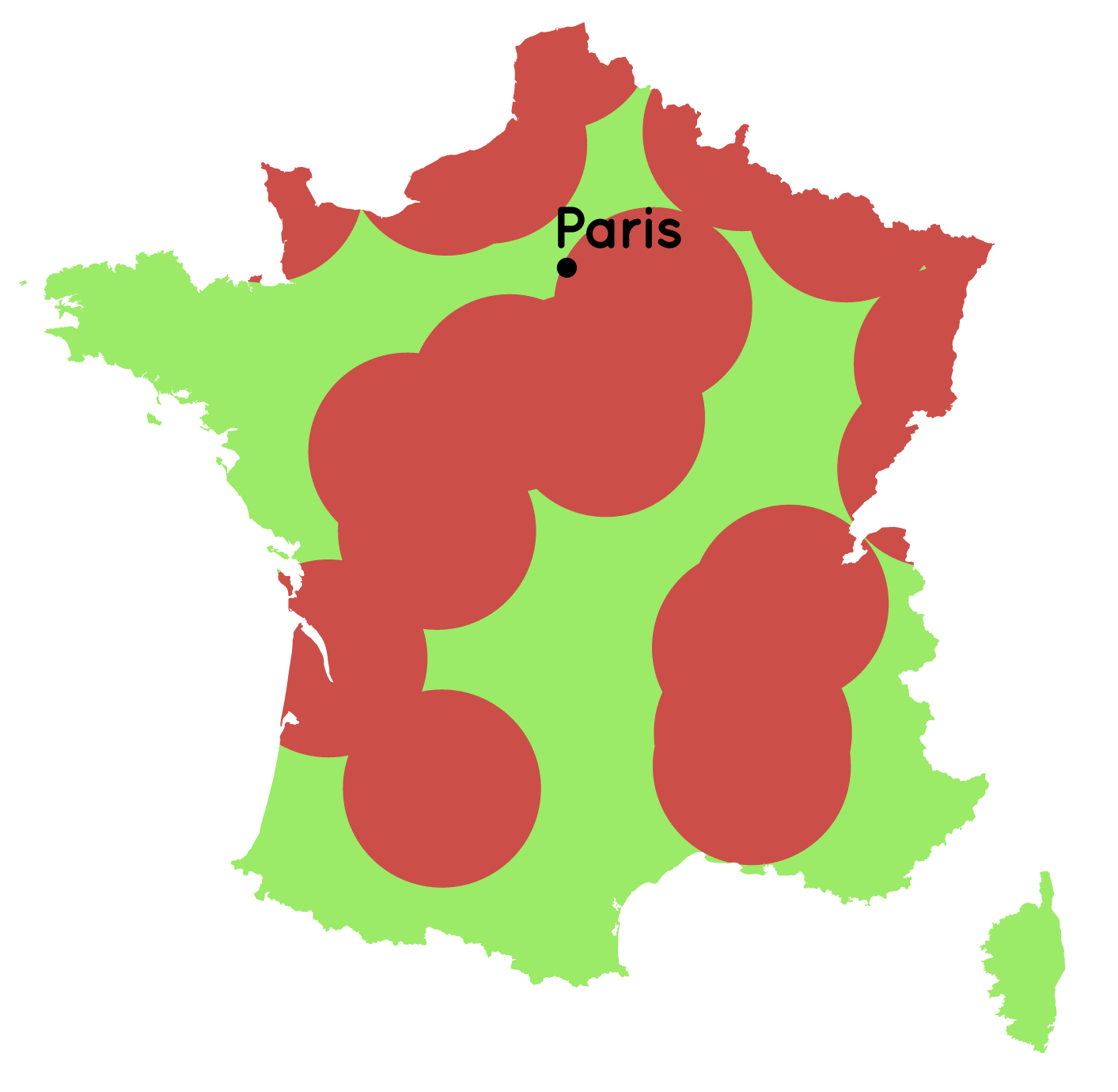
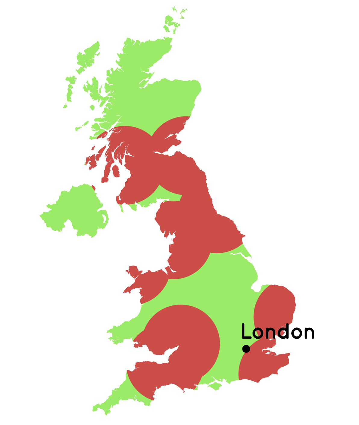
Shortly after the Fukoshima catastrophy in March 2011 I was very interested in the geographic patterns of nuclear power. This map series simply divides the area of a country in regions that are closer than 100km to an active nuclear reactor (red) and those who are not (green).
This idea formed the basis of an interactive infographic I created for ZEIT ONLINE a few days later.
-
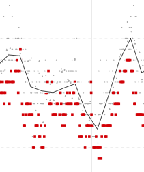
R Analysis of bias in opinion polls
Interactive visualization of the politcal CVs of German cabinet members.
-
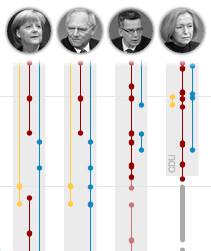
The Cabinet(s) of Germany
Interactive visualization of the politcal CVs of German cabinet members.
-
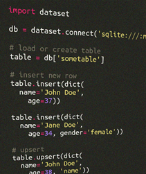
Dataset: databases for lazy people
A handy Python library for managing databases – the pythonic way.
-
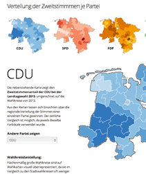
Lower Saxony State Election
A series of interactive visualizations and maps for German state election.
-
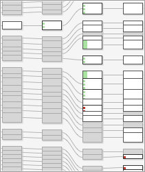
The Making of a Law
Visualization of the version history of the German law on political parties.
-

Datawrapper – Interactive Charting
An open source tool helping anyone to create simple, correct interactive charts in minutes.
-
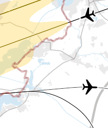
Maps for Berlin Brandenburg Airport
Using Kartograph, I rendered high res maps of airport noise, flight tracks and protection zones.
-
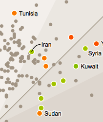
Education Around the World
Interactive Visualisation of Key Statistics in Education around the World
-
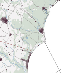
Kartograph Mapping Framework
A novel approach for mapping needs of designers and data journalists.
-

Chroma.js
Open Source Library for working with colors in visualizations
-
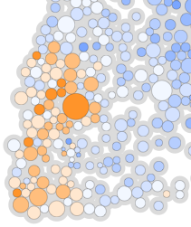
Stuttgart 21 Referendum
Exploring correlation between political preferences and referendum votes
-
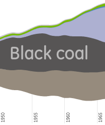
German Energy Landscape
A series of streamgraph visualizations around German energy data.
-
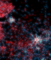
Mapping the Digital Divide
Showing the digital divide by mapping internet usage and population
-
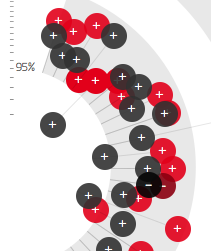
Faction vs Conscience
Closeness of coalition parties at roll-call votes in the German Bundestag
-

Streamgraphs in Flash
ActionScript3 fork of the streamgraph generator by Lee Byron and Martin Wattenberg.
-
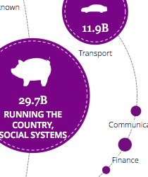
Bubble Tree Library
Open Source tool for visualizing hierarchical data using interactive radial bubble trees.
-
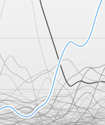
10 Years of Wikipedia
Visualisation of growth patterns of German Wikipedia
-
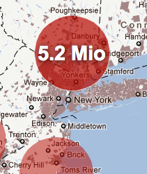
Population near Nuclear Reactors
How many people would have been evacuated in case of an accident?
-
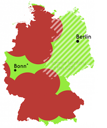
Distances To Nuclear Reactors
Shortest distances to nuclear reactors, mapped for different countries.
-
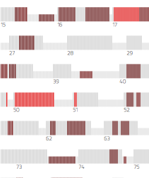
Visualizing Plagiarism
Showing plagiarism patterns in Guttenberg dissertation
-
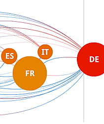
Europe’s Energy
Putting Europe's 2020 energy targets into context.
-
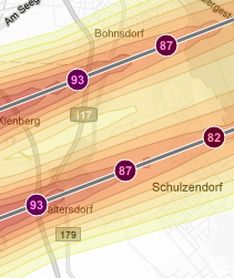
Mapping Airport Noise
Visualizing estimated noise of planned flight routes
-
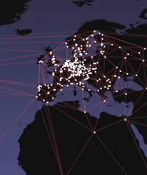
Wikileaks Mirror Network
Animated map of the Rise of mirror servers after blocking of Wikileaks.org
-
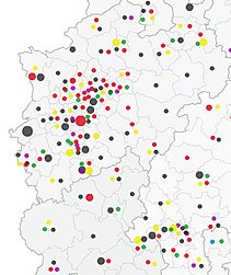
Incomes of Parliament Members
Map of the estimated income of members of the German parliament.
-
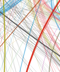
German Party Donations
Visualization of the network of parties, party donors and donations.